Samsung Galaxy Z Fold 3
Foldables have seen significant improvements thanks to Samsung, but there is still room for improvement.
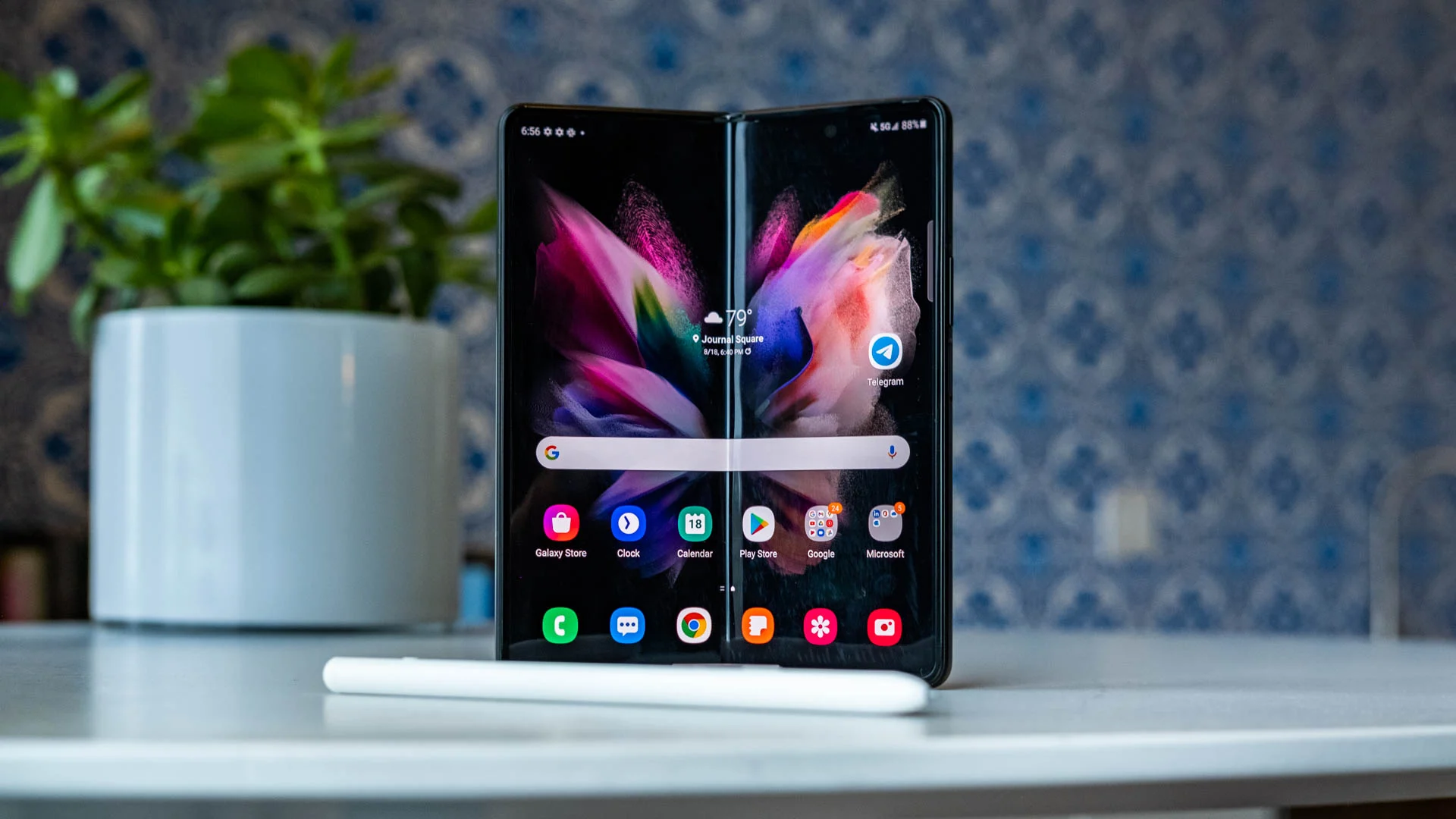
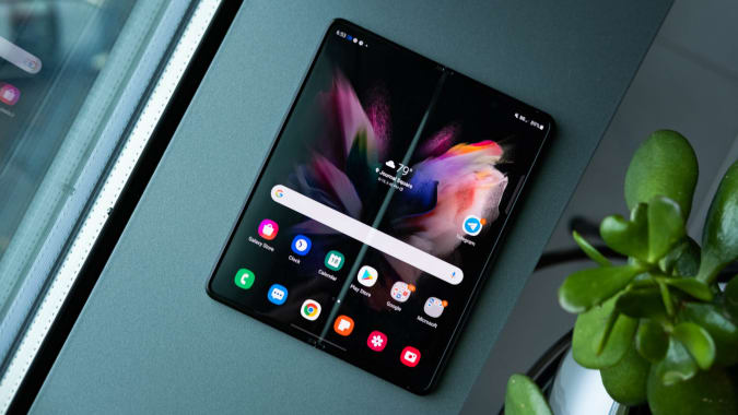
If you’ve been keeping tabs on the growing popularity of foldable smartphones, the Samsung Galaxy Fold is no doubt a favorite. Although it had a bumpy start and a shaky second generation, the series has now entered its third generation. All grown up and stronger than ever, the Galaxy Z Fold 3 is here. Samsung has spent a great deal of time and effort refining the foldable screen, hinge, and overall construction after learning from its youth’s mistakes. Support for the S Pen was added, as was water resistance, and the software was optimized. Starting at $1,800, the phone is now $200 less expensive. However, despite this, the Fold 3 is still struggling to find its identity.
Design
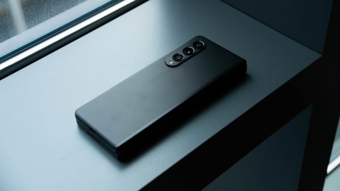
Upon first glance, it’s impossible to tell the Fold 3 apart from the Fold 2. This year’s model is slightly thicker, but otherwise identical in size. However, even though the Fold 3 expands by 0.4 millimeters when unfolded, it actually shrinks by 0.8 millimeters when closed, compared to the Fold 2. Using a new hinge mechanism, Samsung may have been able to reduce the gap between its two screens.
If you’re not comparing apples to apples, you may not notice this. The Fold 3 is also 10 grams (or 0.35 ounces) lighter than its predecessor, which you may not have noticed. But it’s heavier than most smartphones, which is something to keep in mind. Because it weighs more than the iPhone 12 Pro Max and the Samsung Galaxy S21 Ultra combined (45 grams or 1.58 ounces), using it for extended periods of time became tiring on my arm. In any case, it’s basically two phones in one, so the Surface Duo is the only comparable device. Fold 3 is thicker and heavier than Microsoft’s dual-screen phone.
As a result of this, the Surface Duo was less of an engineering challenge than the original Surface. In the case of a foldable device like the Fold and Flip 3, the question of long-term usability and reliability becomes even more pressing. Samsung claims that the Fold’s frame is made of stronger aluminum, the hinge has been streamlined, and the screen’s layers have been redesigned to make the device more durable. Additionally, a stretchable PET protector was applied to the panel. Fold 3’s screen is 80 percent more durable than the Fold 2’s, according to the company.
That’s something I’m unable to test for myself without attempting to harm the Fold 3. There’s no doubt that the screen of this phone is more glass-like than its predecessor’s, and the screen protector completely covers the display so there’s no chance of you peeling it off. Since it hasn’t been that long since the Fold 2 was reviewed, I can’t say for sure if the new model will exhibit the same bubble issues.
Although it’s been thrown around a lot, the Fold 3 hasn’t been damaged and still looks brand new. Thanks to its new IPX8 water-resistance, it also survived a few drops of water after I set it down near the sink while washing my hands.
As long as you have two hands, you can easily hold the Fold 3 in one hand while typing. Though it’s nice to have a phone that can be opened at any angle, the difficulty of unfolding the device is frustrating. In order to extend the device all the way, you’ll need to pry apart the powerful magnets holding it closed and then push firmly. In fact, I nearly dropped the Fold 3 a few times as I struggled to open it.
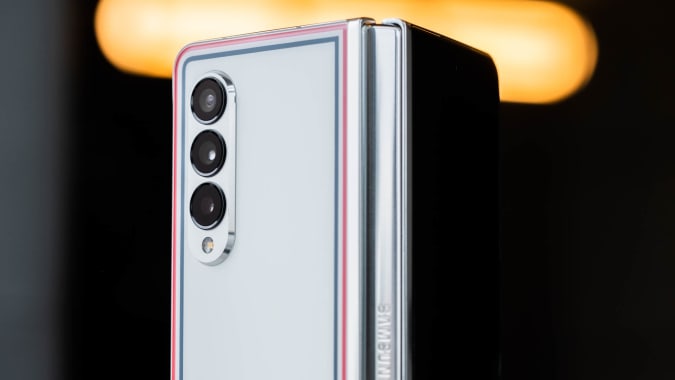
Fortunately, I didn’t, as any blemishes on my all-black review unit would have been obvious. Silver, green, and a Thom Browne-inspired version with red, white, and blue stripes are also available for the Fold 3. A limited-edition bundle of the latter costs $3,450, however.
A tale of two displays
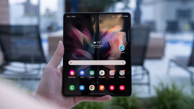
The 6.2-inch 2,268 x 832 display on the Fold 3 now has a refresh rate of 120 Hz. In addition, instead of the Super AMOLED panel of the previous generation, it makes use of a Dynamic AMOLED one, which supports HDR10+. My never-ending inbox is a breeze to scroll through now, and the photos on my Instagram feed are more vibrant thanks to the faster screen. With the exception of these changes, the external display of the Fold 3 is virtually identical to that of its predecessor, meaning it has a similarly narrow aspect ratio.
Although the closed device is easier to use with one hand, this results in a cramped feeling for most content on the device. Long messages and tweets take up more space on the page, making it harder to see everything at once because the buttons on the keyboard are smaller and harder to aim for.
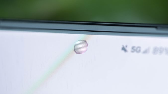
The Fold’s 7.6-inch Dynamic AMOLED panel can be used when you need more space. This has a refresh rate of 120Hz and a resolution of 2,208 x 1,768 like the external display. Under-display cameras (UDCs) can be hidden beneath pixels, so you won’t have to see the small hole that most modern phones have for their selfie sensors, which makes for a more immersive full-screen experience.
For some reason, I’ve never thought of those tiny circles as particularly obstructive or unsightly. Even so, if you despise having to look at the UDC, you should know that the right background or app can make it disappear. There is a ring of pixilation around the camera’s viewfinder even when nothing is displayed on the screen directly above it.
The camera wasn’t bothering me at all, and after a while, I even forgot about it. A small amount of distortion caused by the UDC is likely to be tolerated by the majority of people. My videos and casual games look fantastic on the rest of the screen, which is bright, colorful, and crisp.
Multitasking software and the S Pen
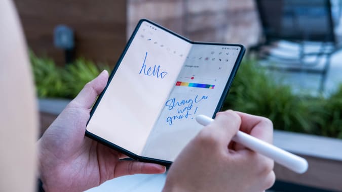
The internal display of the Fold 3 isn’t just good for watching Netflix. This year’s S Pen support makes the foldable screen more useful for those who need to take notes or sketch diagrams on the large surface area of the screen. The S Pen Fold edition costs $50 more, while the Pro model costs $100 more and includes a carrying case. Samsung’s new foldable phone doesn’t need to be charged like the Pro, but it does require power for features like switching between other Samsung devices and Bluetooth controls. If you don’t have a slot for the stylus on the phone, you’ll have to deal with the inconvenience of carrying around a separate accessory.
For those who can afford it, the Fold 3’s S Pen is a useful addition. On Samsung Notes, I mostly used it as a cursor, but it’s also very responsive and fluid when drawing on the larger screen. Additionally, the company provides a “S Pen to text” setting that allows you to mark dittos, arrows, or strokes directly on words to make it easier to edit text. The letters can be erased by simply drawing a line through them.
My dislike of having to carry around additional items for a phone was alleviated by having the S Pen, which made it easier for me to write this review while sitting in a taxi. The stylus was a lifesaver when it came to typing on its larger screen, making swipe typing more accurate. The Samsung system is surprisingly adept at recognizing my awful handwriting in search bars and messaging apps, so that was fun, too.
In spite of my reservations, I can appreciate Samsung’s effort in making S Pen support a reality. I was able to avoid damaging the flexible display while I dragged the nib around the screen during a bumpy ride.
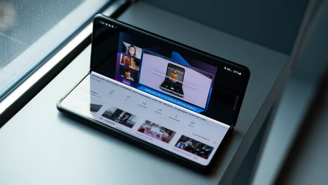
Multitasking features are still available even without the S Pen, thanks to the larger internal panel. While writing a review, you can keep an eye on Slack or Twitter for PlayStation 5 release news on Chrome while simultaneously using the Fold 3 to read articles.
This year, Samsung added the ability to use the Edge panel as a desktop-style taskbar, allowing you quick access to all of your open apps and personal favorites. Despite its simplicity, it’s a huge improvement. There is no longer any need for users to swipe into the Edge panel and then drag an app out to open it in split-screen. In order to run two apps at the same time without feeling cramped, you’ll need to use a column of space. Fortunately, it can be hidden with a simple tap.
This is the first time Samsung has used a floating panel on a smartphone since launching the feature on the Galaxy Note Edge in 2014. What was once a clunky, inconvenient feature has evolved into a useful tool that makes the Fold 3 feel like a more capable multitasking device.
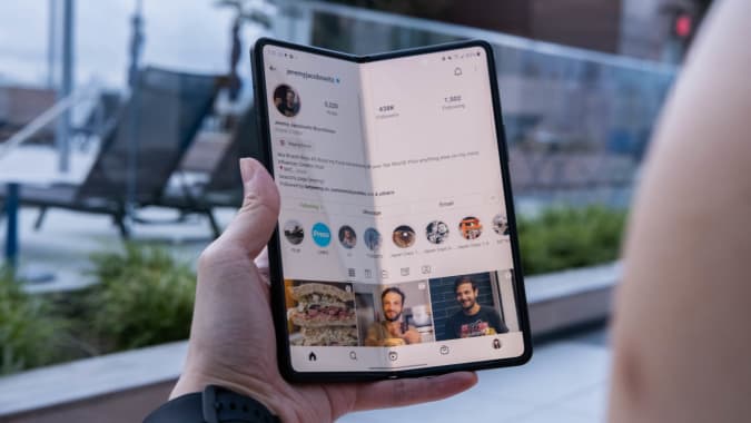
As a final touch, Samsung added the ability to make all apps expand to fullscreen on the Fold. Individual apps can launch in a 16:9, 4:3, or fullscreen format using the company’s experimental Labs settings. An unappealing setup with the phone-sized app in the middle and blank space on either side was once common, for example, on Instagram. To make things even easier, you can now decide how much of the screen they take up.
However, this only partially works. It’s true that my feed now fills the entire screen, but when I try to watch or post Stories, the screen reverts to its phone-sized equivalent. In addition, when enlarged, many Instagram photos appear splotchy. Despite the fact that Samsung still has a long way to go, I applaud their efforts.
Full-screen apps can now be enabled in Labs, including Multi Window and Flex Mode panels for all applications. Both of these can be a success or failure. When you half-open the Fold 3 and set it up like a laptop, the Flex Mode panel adds a mini dashboard to the bottom of the screen. Apps designed for this purpose have well-spaced controls that are useful in this area. In contrast, Samsung’s software places a tiny row of four buttons at the bottom of the screen for keyboard, screenshot, brightness, and volume control for those that aren’t, such as Chrome.
Like how Samsung’s App Continuity feature does not always keep content in its original location when you open up the Fold in order to see something on its larger screen, I could go on about the rest of Samsung’s software. That, however, would take an eternity. If you look at Samsung’s efforts, it seems like they’re focusing more and more on band-aid solutions rather than optimizing Android for tablet devices.
A numer of cameras (including one under a display)
The Fold 3 is an overachiever, like a person who tries to do too much. There are also five cameras onboard, which is almost excessive. As well as the standard, ultra wide, and telephoto lenses found on most smartphones, the UDC also includes a 10 MP selfie camera that is only sharp to 4 MP.
For the most part, these cameras perform as well as the iPhone and Pixel flagships, delivering bright, vibrant images in most situations. I could see individual scallions and rice grains clearly, which was perfect for rows of delectable sushi.
Despite Google’s advantage in low light, my nighttime photos of the USS Intrepid on the Hudson River were sharp and bright. The Pixel 5’s Night Sight mode captured crisp images of trees and buildings, whereas the Fold 3’s image of the same scene was muddy.
However, that is a minor quibble. They are otherwise identical to their conventionally shaped counterparts in other respects. Photos taken with the selfie sensor were also pleasantly crisp and vibrant.
The only issue I have with the quality of photos or videos is with the UDC, and it’s a minor one. When taking selfies or chatting with friends, you’ll be able to tell right away that this is a lower-quality option. The colors aren’t as vibrant, and the details aren’t as sharp. Even so, I’m not expecting much from a 4-megapixel camera, let alone one hidden beneath a display. When all else fails and you’re forced to use the Fold while it’s open, this is a passable solution.
Performance and battery life
The Fold 3 performed admirably, regardless of whether I was using the external or internal display. Slacking my coworkers was a breeze thanks to its Snapdragon 888 processor and 12GB of RAM, which allowed me to easily mark numerous emails as read, write an article while watching video, and play a game. When switching between the two displays, I had to wait a few seconds for an app to reopen, but other than that, everything went smoothly.
In addition, I never had to be concerned about the Fold 3 running out of battery life. It usually lasted at least a day and a half, and sometimes even two days before finally going away. Video playback time was 14 hours and three minutes on the Fold 3’s larger screen. It only lasted 10 hours and 32 minutes in the same configuration as the Surface Duo.
Wrap-up
In the Fold 3, it appears that Samsung has made a concerted effort to make a foldable smartphone/tablet hybrid work. I found myself reaching for the Flip 3 while reviewing it, but I couldn’t think of a single use for Fold 3. Compared to a regular phone, it is heavier and narrower when closed. Open it only for gaming and work on the go for me, please. Fold 3 doesn’t meet my needs when I’m curled up on the couch and want to waste time on Reddit or Twitter. However, I’m not here to debate the philosophical advantages of foldable devices.
A similar problem occurred with the Surface Duo, which tried to be a tablet and phone, but failed at both functions. Even though the Fold 3 is superior in many ways, it will not be able to completely replace a smartphone. After years of development, it’s a well-built, impressive piece of technology. However, it has an identity crisis by trying to be two things at once. That doesn’t mean foldable phones are a thing of the past. Not at all. The Fold may one day be thin and light enough to be useful in all of its modes as components get smaller. For the time being, the Fold 3 isn’t quite ready for prime time despite Samsung’s efforts.
Galaxy Z Fold 3 Review
Performance - 8.8
Display - 8.3
Cost - 8.5
8.5
8.5/10 Total Points
Water-resistant hardware makes the Z Fold 3 even more durable than its predecessors. S Pen support, faster screens, capable cameras, and helpful software are just some of the perks. Using it as a normal smartphone is awkward, and its internal display isn't ideal for casual texting or browsing.

